Activity indicator in SwiftUI
SwiftuiSwiftui Problem Overview
Trying to add a full screen activity indicator in SwiftUI.
I can use .overlay(overlay: ) function in View Protocol.
With this, I can make any view overlay, but I can't find the iOS default style UIActivityIndicatorView equivalent in SwiftUI.
How can I make a default style spinner with SwiftUI?
NOTE: This is not about adding activity indicator in UIKit framework.
Swiftui Solutions
Solution 1 - Swiftui
As of Xcode 12 beta (iOS 14), a new view called ProgressView is available to developers, and that can display both determinate and indeterminate progress.
Its style defaults to CircularProgressViewStyle, which is exactly what we're looking for.
var body: some View {
    VStack {
        ProgressView()
           // and if you want to be explicit / future-proof...
           // .progressViewStyle(CircularProgressViewStyle())
    }
}
Xcode 11.x
Quite a few views are not yet represented in SwiftUI, but it's easily to port them into the system.
You need to wrap UIActivityIndicator and make it UIViewRepresentable.
(More about this can be found in the excellent WWDC 2019 talk - Integrating SwiftUI)
struct ActivityIndicator: UIViewRepresentable {

    @Binding var isAnimating: Bool
    let style: UIActivityIndicatorView.Style

    func makeUIView(context: UIViewRepresentableContext<ActivityIndicator>) -> UIActivityIndicatorView {
        return UIActivityIndicatorView(style: style)
    }

    func updateUIView(_ uiView: UIActivityIndicatorView, context: UIViewRepresentableContext<ActivityIndicator>) {
        isAnimating ? uiView.startAnimating() : uiView.stopAnimating()
    }
}
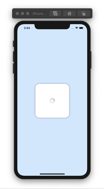
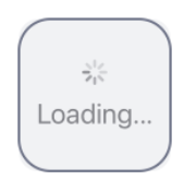
Then you can use it as follows - here's an example of a loading overlay.
Note: I prefer using ZStack, rather than overlay(:_), so I know exactly what's going on in my implementation.
struct LoadingView<Content>: View where Content: View {

    @Binding var isShowing: Bool
    var content: () -> Content

    var body: some View {
        GeometryReader { geometry in
            ZStack(alignment: .center) {

                self.content()
                    .disabled(self.isShowing)
                    .blur(radius: self.isShowing ? 3 : 0)

                VStack {
                    Text("Loading...")
                    ActivityIndicator(isAnimating: .constant(true), style: .large)
                }
                .frame(width: geometry.size.width / 2,
                       height: geometry.size.height / 5)
                .background(Color.secondary.colorInvert())
                .foregroundColor(Color.primary)
                .cornerRadius(20)
                .opacity(self.isShowing ? 1 : 0)

            }
        }
    }

}
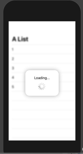
To test it, you can use this example code:
struct ContentView: View {

    var body: some View {
        LoadingView(isShowing: .constant(true)) {
            NavigationView {
                List(["1", "2", "3", "4", "5"], id: \.self) { row in
                    Text(row)
                }.navigationBarTitle(Text("A List"), displayMode: .large)
            }
        }
    }

}
Result:
Solution 2 - Swiftui
iOS 14
it's just a simple view.
ProgressView()
Currently, it's defaulted to CircularProgressViewStyle but you can manually set the style of it by adding the following modifer:
.progressViewStyle(CircularProgressViewStyle())
Also, the style could be anything that conforms to ProgressViewStyle
iOS 13 and above
> Fully customizable Standard UIActivityIndicator in SwiftUI: (Exactly as a native View):
You can build and configure it (as much as you could in the original UIKit):
ActivityIndicator(isAnimating: loading)
    .configure { $0.color = .yellow } // Optional configurations (🎁 bouns)
    .background(Color.blue)
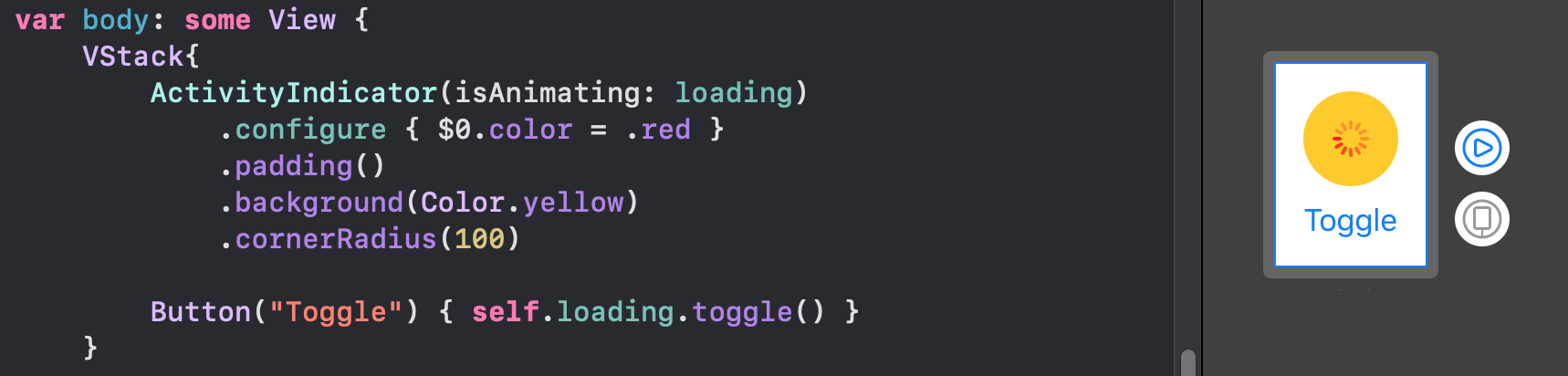
Just implement this base struct and you will be good to go:
struct ActivityIndicator: UIViewRepresentable {

    typealias UIView = UIActivityIndicatorView
    var isAnimating: Bool
    fileprivate var configuration = { (indicator: UIView) in }

    func makeUIView(context: UIViewRepresentableContext<Self>) -> UIView { UIView() }
    func updateUIView(_ uiView: UIView, context: UIViewRepresentableContext<Self>) {
        isAnimating ? uiView.startAnimating() : uiView.stopAnimating()
        configuration(uiView)
    }
}
Bouns Extension:
With this little helpful extension, you can access the configuration through a modifier like other SwiftUI views:
extension View where Self == ActivityIndicator {
    func configure(_ configuration: @escaping (Self.UIView)->Void) -> Self {
        Self.init(isAnimating: self.isAnimating, configuration: configuration)
    }
}
The classic way:
Also you can configure the view in a classic initializer:
ActivityIndicator(isAnimating: loading) {
    $0.color = .red
    $0.hidesWhenStopped = false
    //Any other UIActivityIndicatorView property you like
}
This method is fully adaptable. For example, you can see How to make TextField become the first responder with the same method here
Solution 3 - Swiftui
If you want to a swift-ui-style solution, then this is the magic:
import Foundation
import SwiftUI

struct ActivityIndicator: View {

    @State private var isAnimating: Bool = false

    var body: some View {
        GeometryReader { (geometry: GeometryProxy) in
            ForEach(0..<5) { index in
                Group {
                    Circle()
                        .frame(width: geometry.size.width / 5, height: geometry.size.height / 5)
                        .scaleEffect(calcScale(index: index))
                        .offset(y: calcYOffset(geometry))
                }.frame(width: geometry.size.width, height: geometry.size.height)
                    .rotationEffect(!self.isAnimating ? .degrees(0) : .degrees(360))
                    .animation(Animation
                                .timingCurve(0.5, 0.15 + Double(index) / 5, 0.25, 1, duration: 1.5)
                                .repeatForever(autoreverses: false))
            }
        }
        .aspectRatio(1, contentMode: .fit)
        .onAppear {
            self.isAnimating = true
        }
    }

    func calcScale(index: Int) -> CGFloat {
        return (!isAnimating ? 1 - CGFloat(Float(index)) / 5 : 0.2 + CGFloat(index) / 5)
    }

    func calcYOffset(_ geometry: GeometryProxy) -> CGFloat {
        return geometry.size.width / 10 - geometry.size.height / 2
    }

}
Simply to use:
ActivityIndicator()
.frame(width: 50, height: 50)
Hope it helps!
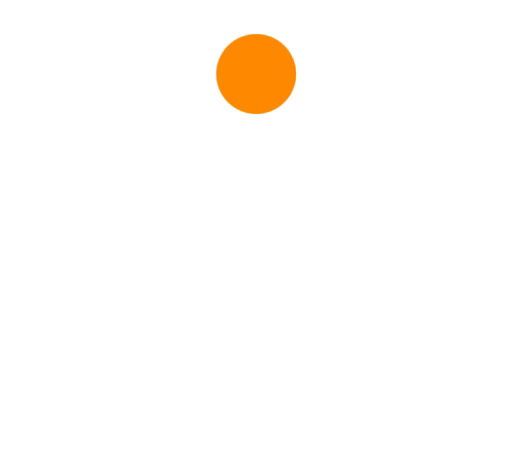
Example Usage:
ActivityIndicator()
    .frame(width: 200, height: 200)
    .foregroundColor(.orange)
Solution 4 - Swiftui
Custom Indicators
Although Apple supports native Activity Indicator now from the SwiftUI 2.0, You can Simply implement your own animations. These are all supported on SwiftUI 1.0. Also it is working in widgets.
Arcs
struct Arcs: View {
    @Binding var isAnimating: Bool
    let count: UInt
    let width: CGFloat
    let spacing: CGFloat

    var body: some View {
        GeometryReader { geometry in
            ForEach(0..<Int(count)) { index in
                item(forIndex: index, in: geometry.size)
                    .rotationEffect(isAnimating ? .degrees(360) : .degrees(0))
                    .animation(
                        Animation.default
                            .speed(Double.random(in: 0.2...0.5))
                            .repeatCount(isAnimating ? .max : 1, autoreverses: false)
                    )
            }
        }
        .aspectRatio(contentMode: .fit)
    }

    private func item(forIndex index: Int, in geometrySize: CGSize) -> some View {
        Group { () -> Path in
            var p = Path()
            p.addArc(center: CGPoint(x: geometrySize.width/2, y: geometrySize.height/2),
                     radius: geometrySize.width/2 - width/2 - CGFloat(index) * (width + spacing),
                     startAngle: .degrees(0),
                     endAngle: .degrees(Double(Int.random(in: 120...300))),
                     clockwise: true)
            return p.strokedPath(.init(lineWidth: width))
        }
        .frame(width: geometrySize.width, height: geometrySize.height)
    }
}
Demo of different variations

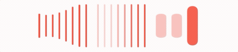
Bars
struct Bars: View {
    @Binding var isAnimating: Bool
    let count: UInt
    let spacing: CGFloat
    let cornerRadius: CGFloat
    let scaleRange: ClosedRange<Double>
    let opacityRange: ClosedRange<Double>

    var body: some View {
        GeometryReader { geometry in
            ForEach(0..<Int(count)) { index in
                item(forIndex: index, in: geometry.size)
            }
        }
        .aspectRatio(contentMode: .fit)
    }

    private var scale: CGFloat { CGFloat(isAnimating ? scaleRange.lowerBound : scaleRange.upperBound) }
    private var opacity: Double { isAnimating ? opacityRange.lowerBound : opacityRange.upperBound }

    private func size(count: UInt, geometry: CGSize) -> CGFloat {
        (geometry.width/CGFloat(count)) - (spacing-2)
    }

    private func item(forIndex index: Int, in geometrySize: CGSize) -> some View {
        RoundedRectangle(cornerRadius: cornerRadius,  style: .continuous)
            .frame(width: size(count: count, geometry: geometrySize), height: geometrySize.height)
            .scaleEffect(x: 1, y: scale, anchor: .center)
            .opacity(opacity)
            .animation(
                Animation
                    .default
                    .repeatCount(isAnimating ? .max : 1, autoreverses: true)
                    .delay(Double(index) / Double(count) / 2)
            )
            .offset(x: CGFloat(index) * (size(count: count, geometry: geometrySize) + spacing))
    }
}
Demo of different variations
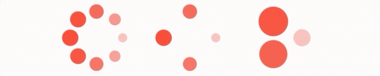
Blinkers
struct Blinking: View {
    @Binding var isAnimating: Bool
    let count: UInt
    let size: CGFloat

    var body: some View {
        GeometryReader { geometry in
            ForEach(0..<Int(count)) { index in
                item(forIndex: index, in: geometry.size)
                    .frame(width: geometry.size.width, height: geometry.size.height)

            }
        }
        .aspectRatio(contentMode: .fit)
    }

    private func item(forIndex index: Int, in geometrySize: CGSize) -> some View {
        let angle = 2 * CGFloat.pi / CGFloat(count) * CGFloat(index)
        let x = (geometrySize.width/2 - size/2) * cos(angle)
        let y = (geometrySize.height/2 - size/2) * sin(angle)
        return Circle()
            .frame(width: size, height: size)
            .scaleEffect(isAnimating ? 0.5 : 1)
            .opacity(isAnimating ? 0.25 : 1)
            .animation(
                Animation
                    .default
                    .repeatCount(isAnimating ? .max : 1, autoreverses: true)
                    .delay(Double(index) / Double(count) / 2)
            )
            .offset(x: x, y: y)
    }
}
Demo of different variations
For the sake of preventing walls of code, you can find more elegant indicators in this repo hosted on the git.
Note that all these animations have a Binding that MUST toggle to be run.
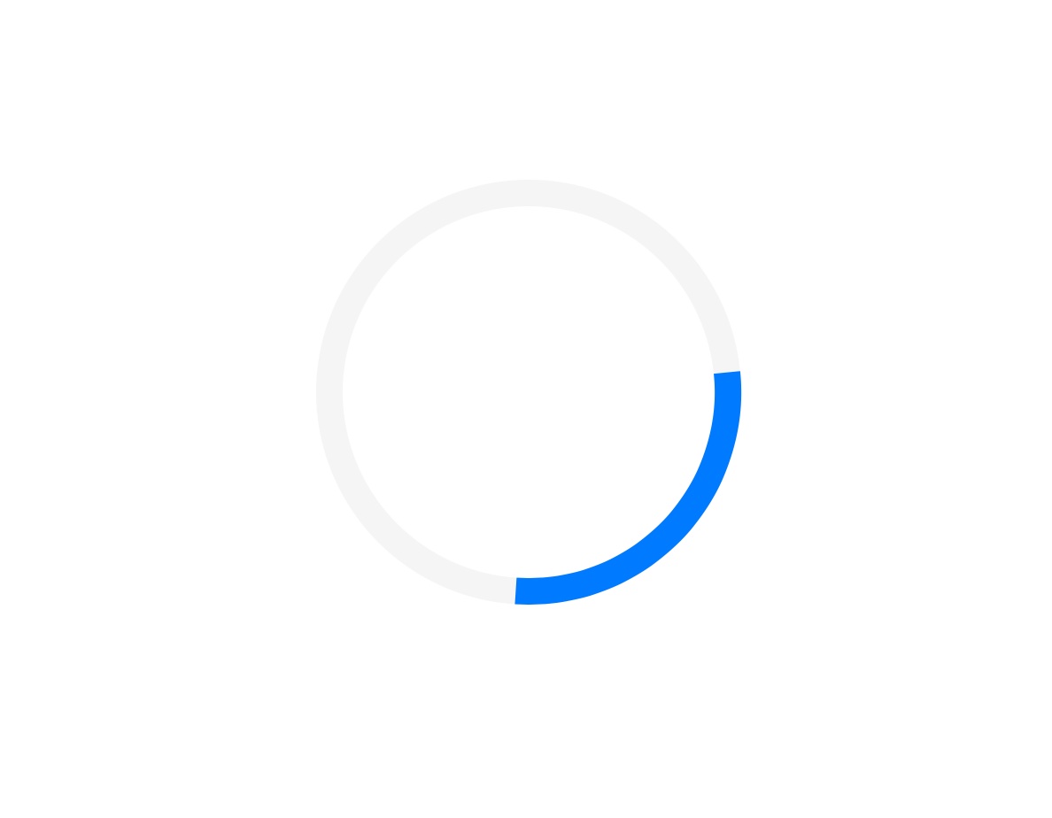
Solution 5 - Swiftui
struct ContentView: View {

    @State private var isCircleRotating = true
    @State private var animateStart = false
    @State private var animateEnd = true

    var body: some View {

        ZStack {
            Circle()
                .stroke(lineWidth: 10)
                .fill(Color.init(red: 0.96, green: 0.96, blue: 0.96))
                .frame(width: 150, height: 150)

            Circle()
                .trim(from: animateStart ? 1/3 : 1/9, to: animateEnd ? 2/5 : 1)
                .stroke(lineWidth: 10)
                .rotationEffect(.degrees(isCircleRotating ? 360 : 0))
                .frame(width: 150, height: 150)
                .foregroundColor(Color.blue)
                .onAppear() {
                    withAnimation(Animation
                                    .linear(duration: 1)
                                    .repeatForever(autoreverses: false)) {
                        self.isCircleRotating.toggle()
                    }
                    withAnimation(Animation
                                    .linear(duration: 1)
                                    .delay(0.5)
                                    .repeatForever(autoreverses: true)) {
                        self.animateStart.toggle()
                    }
                    withAnimation(Animation
                                    .linear(duration: 1)
                                    .delay(1)
                                    .repeatForever(autoreverses: true)) {
                        self.animateEnd.toggle()
                    }
                }
        }
    }
}
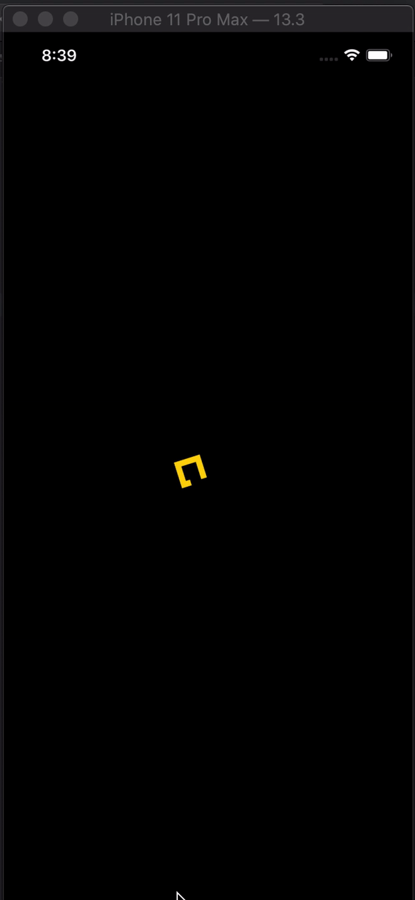
Solution 6 - Swiftui
Activity indicator in SwiftUI
import SwiftUI

struct Indicator: View {

    @State var animateTrimPath = false
    @State var rotaeInfinity = false

    var body: some View {

        ZStack {
            Color.black
                .edgesIgnoringSafeArea(.all)
            ZStack {
                Path { path in
                    path.addLines([
                        .init(x: 2, y: 1),
                        .init(x: 1, y: 0),
                        .init(x: 0, y: 1),
                        .init(x: 1, y: 2),
                        .init(x: 3, y: 0),
                        .init(x: 4, y: 1),
                        .init(x: 3, y: 2),
                        .init(x: 2, y: 1)
                    ])
                }
                .trim(from: animateTrimPath ? 1/0.99 : 0, to: animateTrimPath ? 1/0.99 : 1)
                .scale(50, anchor: .topLeading)
                .stroke(Color.yellow, lineWidth: 20)
                .offset(x: 110, y: 350)
                .animation(Animation.easeInOut(duration: 1.5).repeatForever(autoreverses: true))
                .onAppear() {
                    self.animateTrimPath.toggle()
                }
            }
            .rotationEffect(.degrees(rotaeInfinity ? 0 : -360))
            .scaleEffect(0.3, anchor: .center)
            .animation(Animation.easeInOut(duration: 1.5)
            .repeatForever(autoreverses: false))
            .onAppear(){
                self.rotaeInfinity.toggle()
            }
        }
    }
}

struct Indicator_Previews: PreviewProvider {
    static var previews: some View {
        Indicator()
    }
}
Solution 7 - Swiftui
I implemented the classic UIKit indicator using SwiftUI. See the activity indicator in action here
struct ActivityIndicator: View {
  @State private var currentIndex: Int = 0

  func incrementIndex() {
    currentIndex += 1
    DispatchQueue.main.asyncAfter(deadline: .now() + .milliseconds(50), execute: {
      self.incrementIndex()
    })
  }

  var body: some View {
    GeometryReader { (geometry: GeometryProxy) in
      ForEach(0..<12) { index in
        Group {
          Rectangle()
            .cornerRadius(geometry.size.width / 5)
            .frame(width: geometry.size.width / 8, height: geometry.size.height / 3)
            .offset(y: geometry.size.width / 2.25)
            .rotationEffect(.degrees(Double(-360 * index / 12)))
            .opacity(self.setOpacity(for: index))
        }.frame(width: geometry.size.width, height: geometry.size.height)
      }
    }
    .aspectRatio(1, contentMode: .fit)
    .onAppear {
      self.incrementIndex()
    }
  }

  func setOpacity(for index: Int) -> Double {
    let opacityOffset = Double((index + currentIndex - 1) % 11 ) / 12 * 0.9
    return 0.1 + opacityOffset
  }
}

struct ActivityIndicator_Previews: PreviewProvider {
  static var previews: some View {
    ActivityIndicator()
      .frame(width: 50, height: 50)
      .foregroundColor(.blue)
  }
}
Solution 8 - Swiftui
You have .progressViewStyle modifier for ProgressView(), where you can change the style of the activity indicator.
Solution 9 - Swiftui
In addition to Mojatba Hosseini's answer,
I've made a few updates so that this can be put in a swift package:
Activity indicator:
import Foundation
import SwiftUI
import UIKit

public struct ActivityIndicator: UIViewRepresentable {

  public typealias UIView = UIActivityIndicatorView
  public var isAnimating: Bool = true
  public var configuration = { (indicator: UIView) in }

 public init(isAnimating: Bool, configuration: ((UIView) -> Void)? = nil) {
    self.isAnimating = isAnimating
    if let configuration = configuration {
        self.configuration = configuration
    }
 }

 public func makeUIView(context: UIViewRepresentableContext<Self>) -> UIView {
    UIView()
 }

 public func updateUIView(_ uiView: UIView, context:
    UIViewRepresentableContext<Self>) {
     isAnimating ? uiView.startAnimating() : uiView.stopAnimating()
     configuration(uiView)
}}
Extension:
public extension View where Self == ActivityIndicator {
func configure(_ configuration: @escaping (Self.UIView) -> Void) -> Self {
    Self.init(isAnimating: self.isAnimating, configuration: configuration)
 }
}
Solution 10 - Swiftui
It's really easy with SwiftUI 2.0 I made this simple and easy custom view with ProgressView
Here is how it looks:
Code:
import SwiftUI

struct ActivityIndicatorView: View {
    @Binding var isPresented:Bool
    var body: some View {
        if isPresented{
            ZStack{
                RoundedRectangle(cornerRadius: 15).fill(CustomColor.gray.opacity(0.1))
                ProgressView {
                    Text("Loading...")
                        .font(.title2)
                }
            }.frame(width: 120, height: 120, alignment: .center)
            .background(RoundedRectangle(cornerRadius: 25).stroke(CustomColor.gray,lineWidth: 2))
        }
    }
}
Solution 11 - Swiftui
A convenient way in SwiftUI that I found useful is 2 step approach:
-
Create a
ViewModifierthat will embed your view intoZStackand add progress indicator on top. Could be something like this:struct LoadingIndicator: ViewModifier { let width = UIScreen.main.bounds.width * 0.3 let height = UIScreen.main.bounds.width * 0.3 func body(content: Content) -> some View { return ZStack { content .disabled(true) .blur(radius: 2) //gray background VStack{} .frame(width: UIScreen.main.bounds.width, height: UIScreen.main.bounds.height) .background(Color.gray.opacity(0.2)) .cornerRadius(20) .edgesIgnoringSafeArea(.all) //progress indicator ProgressView() .frame(width: width, height: height) .background(Color.white) .cornerRadius(20) .opacity(1) .shadow(color: Color.gray.opacity(0.5), radius: 4.0, x: 1.0, y: 2.0) } } -
Create view extension that will make conditional modifier application available to any view:
extension View { /// Applies the given transform if the given condition evaluates to `true`. /// - Parameters: /// - condition: The condition to evaluate. /// - transform: The transform to apply to the source `View`. /// - Returns: Either the original `View` or the modified `View` if the condition is `true`. @ViewBuilder func `if`<Content: View>(_ condition: Bool, transform: (Self) -> Content) -> some View { if condition { transform(self) } else { self } } } -
Usage is very intuitive. Suppose that
myView()returns whatever your view is. You just conditionally apply the modifier using.ifview extension from step 2:var body: some View { myView() .if(myViewModel.isLoading){ view in view.modifier(LoadingIndicator()) } }
In case that myViewModel.isLoading is false, no modifier will be applied, so loading indicator won't show.
Of course, you can use any kind of progress indicator you wish - default or your own custom one.
Solution 12 - Swiftui
Try this:
import SwiftUI

struct LoadingPlaceholder: View {
    var text = "Loading..."
    init(text:String ) {
        self.text = text
    }
    var body: some View {
        VStack(content: {
            ProgressView(self.text)
        })
    }
}
More information about at SwiftUI ProgressView
Solution 13 - Swiftui
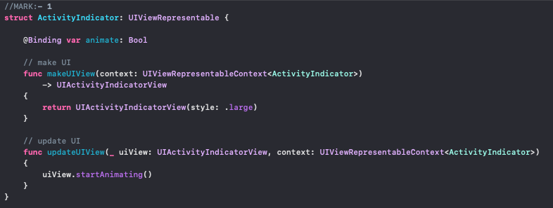
// Activity View

struct ActivityIndicator: UIViewRepresentable {

    let style: UIActivityIndicatorView.Style
    @Binding var animate: Bool

    private let spinner: UIActivityIndicatorView = {
        $0.hidesWhenStopped = true
        return $0
    }(UIActivityIndicatorView(style: .medium))

    func makeUIView(context: UIViewRepresentableContext<ActivityIndicator>) -> UIActivityIndicatorView {
        spinner.style = style
        return spinner
    }

    func updateUIView(_ uiView: UIActivityIndicatorView, context: UIViewRepresentableContext<ActivityIndicator>) {
        animate ? uiView.startAnimating() : uiView.stopAnimating()
    }

    func configure(_ indicator: (UIActivityIndicatorView) -> Void) -> some View {
        indicator(spinner)
        return self
    }
}

// Usage
struct ContentView: View {

    @State var animate = false

    var body: some View {
            ActivityIndicator(style: .large, animate: $animate)
                .configure {
                    $0.color = .red
            }
            .background(Color.blue)
    }
}
Solution 14 - Swiftui
my 2 cents for nice and simpler code of batuhankrbb, showing use of isPresented in timer... or other stuff... (I will use it in url callback..)
//
//  ContentView.swift
//
//  Created by ing.conti on 27/01/21.


import SwiftUI

struct ActivityIndicatorView: View {
    @Binding var isPresented:Bool
    var body: some View {
        if isPresented{
            ZStack{
                RoundedRectangle(cornerRadius: 15).fill(Color.gray.opacity(0.1))
                ProgressView {
                    Text("Loading...")
                        .font(.title2)
                }
            }.frame(width: 120, height: 120, alignment: .center)
            .background(RoundedRectangle(cornerRadius: 25).stroke(Color.gray,lineWidth: 2))
        }
    }
}


struct ContentView: View {
    @State var isPresented = false
    @State var counter = 0
    var body: some View {

        VStack{
            Text("Hello, world! \(counter)")
                .padding()

            ActivityIndicatorView(isPresented: $isPresented)
        }.onAppear(perform: {
            _ = startRefreshing()
        })
    }


    func startRefreshing()->Timer{

        let timer = Timer.scheduledTimer(withTimeInterval: 1, repeats: true) { timer in

            counter+=1
            print(counter)
            if counter>2{
                isPresented = true
            }

            if counter>4{
                isPresented = false
                timer.invalidate()
            }
        }
        return timer
    }
}

struct ContentView_Previews: PreviewProvider {
    static var previews: some View {
        ContentView()
    }
}
Solution 15 - Swiftui
I have modified Matteo Pacini's Answer for macOS using AppKit and SwiftUI. This allows you to use NSProgressIndicator in SwiftUI while retaining capability for macOS 10.15.
import AppKit
import SwiftUI

struct ActivityIndicator: NSViewRepresentable {

    @Binding var isAnimating: Bool
    let style: NSProgressIndicator.Style

    func makeNSView(context: NSViewRepresentableContext<ActivityIndicator>) -> NSProgressIndicator {
        let progressIndicator = NSProgressIndicator()
        progressIndicator.style = self.style
        return progressIndicator
    }

    func updateNSView(_ nsView: NSProgressIndicator, context: NSViewRepresentableContext<ActivityIndicator>) {
        isAnimating ? nsView.startAnimation(nil) : nsView.stopAnimation(nil)
    }

}
Usage is as follows:
ActivityIndicator(isAnimating: .constant(true), style: .spinning)
Solution 16 - Swiftui
Result of Basic Activity Indicator :